Feeding America Data Commons provides access to data from Map the Meal
Gap, overlayed with data from a wide range of additional sources into a single
portal under a common scheme.
Learn more ›
Explore the data
Whoever you are - journalist, citizen scientist, student or researcher - here are a few starter examples to explore food security in the United States and its relationship to climate data and health indicators.
Climate change and food insecurity in California
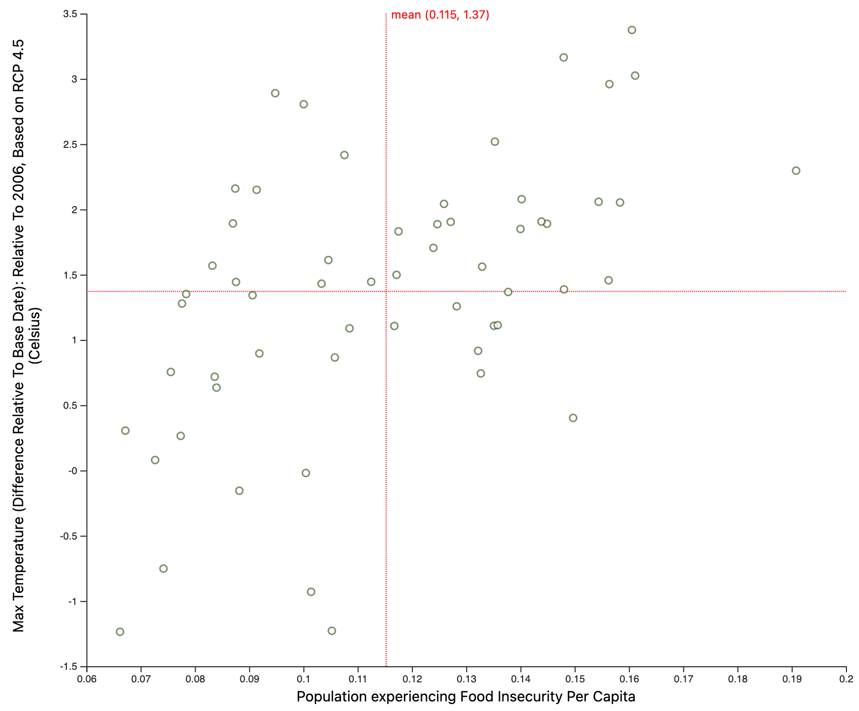 Max projected summer temperatures (RCP 4.5) vs. Food Insecurity for US counties (source: FA, NASA)
While there are
significant urban populations in California with food insecurity challenges
today e.g. Los Angeles County, when food insecurity numbers are mapped with
anticipated temperature rises, the people of Kern County, the heart of
California’s agricultural ecosystem that serves the world, will likely
experience the greatest strife in the years to come.
Max projected summer temperatures (RCP 4.5) vs. Food Insecurity for US counties (source: FA, NASA)
While there are
significant urban populations in California with food insecurity challenges
today e.g. Los Angeles County, when food insecurity numbers are mapped with
anticipated temperature rises, the people of Kern County, the heart of
California’s agricultural ecosystem that serves the world, will likely
experience the greatest strife in the years to come.
Cardiac Health and food insecurity across the United States
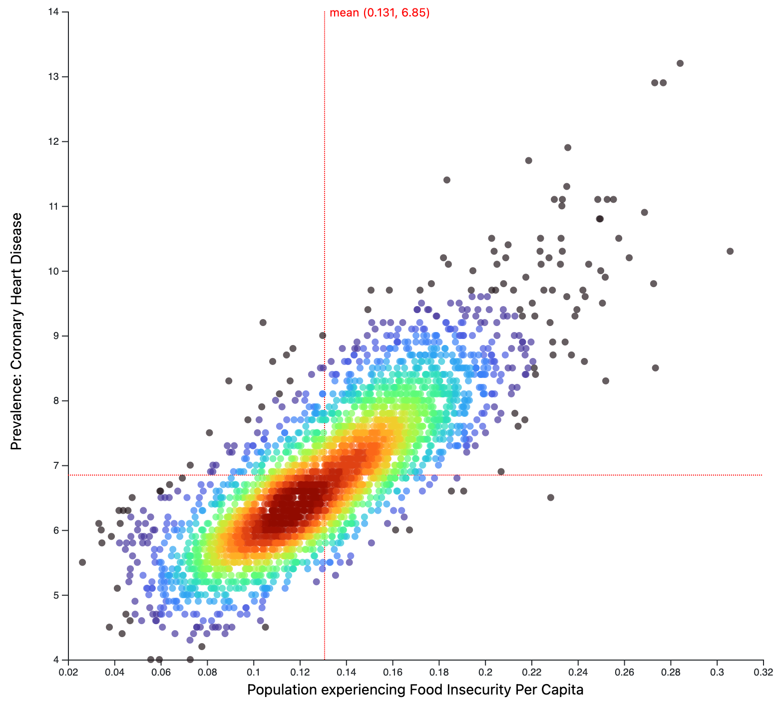 Heart condition vs. Food insecure for US counties (source: CDC, FA)
Combining datasets from the CDC and Map the Meal gap, the
correlation between heart health and food insecurity is clear. With Data
Commons, it is possible for any food bank or pantry on the ground to
explore these correlations and other health conditions in their city
and county without a significant investment of technical resources,
and months of research.
Heart condition vs. Food insecure for US counties (source: CDC, FA)
Combining datasets from the CDC and Map the Meal gap, the
correlation between heart health and food insecurity is clear. With Data
Commons, it is possible for any food bank or pantry on the ground to
explore these correlations and other health conditions in their city
and county without a significant investment of technical resources,
and months of research.
Food insecure individuals with low income and no health insurance
 Population of low income without health insurance vs. Food insecure, for US counties (source: CDC, FA, NASA)
Combining data from the US Census and Map the Meal gap, it is
immediately apparent that large parts of middle America are struggling
from these interrelated challenges. Instead of per capita numbers, one
could also view the actual counts of food insecure residents without
health insurance and making less than $25,000/year. Los Angeles County
stands out immediately.
Population of low income without health insurance vs. Food insecure, for US counties (source: CDC, FA, NASA)
Combining data from the US Census and Map the Meal gap, it is
immediately apparent that large parts of middle America are struggling
from these interrelated challenges. Instead of per capita numbers, one
could also view the actual counts of food insecure residents without
health insurance and making less than $25,000/year. Los Angeles County
stands out immediately.